Spotify Listening Patterns
Idea
Because of my FYP, I explored a lot of data visualization libraries. I was fascinated by plotly; it provided everything matplotlib did but it was so much PRETTIER. And, it had interactive plots - which is more often than not, a paid service (looking at you, Tableau). Around Jun 2020, I also realized I was listening to Spotify a lot more than Apple Music, having switched services a year ago. So, I decided to combine these two and analyze my listening patterns.
On a side note - have I mentioned how much I LOVE Spotify’s Discover Weekly feature?
Tech Stack
I made a Jupyter notebook for this project. This is what I decided to analyze -
- Monthly listening analytics
- Top 10 songs
- Most played artists
- Listening patterns during a day
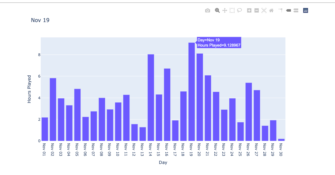
This is an interactive graph on the Notebook. How amazing is Plotly!
You can use an external notebook viewer to view my data viz results and graphs yourself.
Future Improvements
- Spotify Wrapped does a pretty good job of displaying which genres you play the most - however, I have a feeling it is not too accurate. I want to integrate with
LastFMAPI to further analyze which genres I listen to the most. - Make this project extensible so that anybody can plug in their data and use it to visualize their results.
- Make this a web-service.
PROJECTS
personal python